October 4, 2020 (Originally posted on Neocities)
PS4 Icons, Judged as Switch Icons
I've noticed some shared traits on what makes a "good" Switch icon versus a "bad" one. Long story short, don't make it a mobile app icon. However I've also seen that the PS4 has icons in a similar format to that of the Switch, namely squares, and for all I know the Xbone does it too, but I can't really check. What I can do, though, is look at all the game-type stuff on my PS4 and see how icons on those would work, given the Switch icon philosophy.
For this review, I'll exclude icons that specifically label themselves as demo versions, but will include icons for demos otherwise. I'm also excluding "apps" such as videos and manuals, these things have to be enough like games to count here. The main thing to note is that the PS4 shows icons alongside their titles more often than the Switch does, which is probably why a lot of icons lack a title. Please excuse the fuzzy icon quality as I just took screenshots from the remote PS4 thing since it's hard to find a definitive list of PS4 icons like with Switch ones.
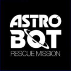 Astro Bot Rescue Mission
This icon is pretty basic, it's just the logo for the game in a totally black and white image. It doesn't feel enough like cover art to fit as a Switch icon, but it's not the worst kind at least.
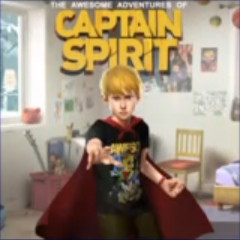 The Awesome Adventures of Captain Spirit
I think this one works well for a Switch icon, there's the title, the main character, a proper background, pretty sure this would be the cover art if this was a game that was sold in stores.
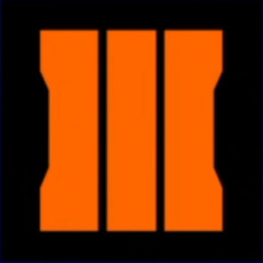 Call of Duty: Black Ops 3
Definitely not a good Switch icon. Sniper Elite 3 had the same issue of just a giant Roman numeral 3 before that game had its Switch icon updated. They were trying to enforce the giant orange numeral here as a branding logo, but it's a branding you have to really be familiar with to even recognize.
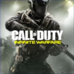 Call of Duty: Infinite Warfare
A suitable Switch icon format, being pretty much the box art and featuring a space suit soldier doing space combat stuff probably. Call of Duty box art can be considered pretty generic, but at least this fits the format.
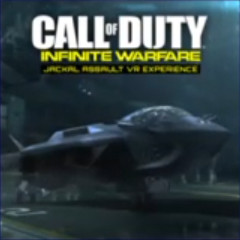 Call of Duty: Infinite Warfare: Jackal Assault
This would also work as a Switch icon, as this is a short VR experience involving flying one of these space jets around, and said space jet is prominent on the cover.
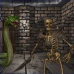 Crypt of the Serpent King (Demo)
Looks like generic CGI fantasy graphics for a game that exists on PS4 somehow. There's no title, so telling what game this is at a glance is unlikely.
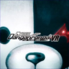 Cyber Danganronpa VR: The Class Trial
A stylized but effective icon, showing the series mascot in an extreme closeup while still having the logo present.
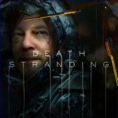 Death Stranding
This one is pretty much the box art, minus the reminder that this is A Hideo Kojima Game. It works as well as the box art, naturally, for this very strange game that might be hard to summarize otherwise if any other approach was taken.
 Digimon World: Next Order
This is the box art, minus the logo. Maybe a colorful crowd of characters could be picked out of a list if it's not full of other crowds of colorful characters, but I think this would need the logo to fit its best as a Switch icon.
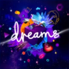 Dreams
The logo in an exploding cloud of purple creativity. That's effective branding and would fit nicely.
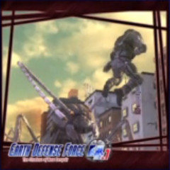 Earth Defense Force 4.1
The art seems a bit unclear as to what's happening, and it has a border around it while the logo is shoved in the corner. I'm not sure this would work well as a Switch icon, but it feels more like a wallpaper.
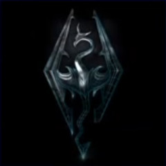 The Elder Scrolls V: Skyrim VR
Just the dragon logo, sure. But this time it's becoming wireframe, so somehow that implies VR. Not an acceptable Switch icon here, it's too "mobile". In fact it's very similar to the Elder Scrolls Blades icon on Switch, which has still not changed and probably won't since that's a mobile port as well.
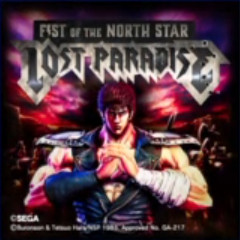 Fist of the North Star: Lost Paradise
This is a pretty good fit for a Switch icon, a striking logo with a recognizable character. The only weird thing is the copyright text on the icon itself, which is there for… certain copyright reasons. Games like these involving manga or anime characters can get that way on the game media, which can get really absurd on something as tiny as a Switch game card.
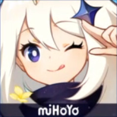 Genshin Impact
This screams "mobile app", from the giant anime face to the company logo stuck on the bottom, with no sign of the game logo itself. If this is how it looks on the Switch, there's probably already demand for change, if it hasn't already changed.
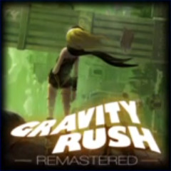 Gravity Rush Remastered
There's a vignette that acts a bit like a border, but otherwise I feel like this is a good fit for a Switch icon.
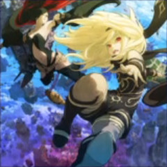 Gravity Rush 2
The box art without the logo, so for best fit as a Switch icon, it should probably have the logo.
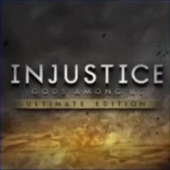 Injustice: Gods Among Us Ultimate Edition
A somewhat generic logo on a somewhat generic background. Hard to tell that this would have anything to do with DC characters without already knowing. Maybe something more indicative of that would help make this a better Switch icon.
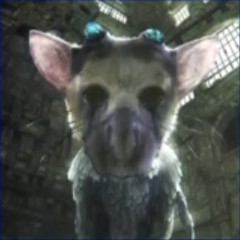 The Last Guardian VR Demo
This game isn't in VR, but there's a short experience based on it. I suppose this works if you know to look for some kind of bird dog dragon, but a logo may help.
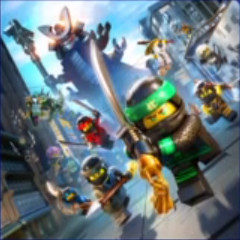 Lego Ninjago Movie Game
Really, all this is missing is the logo. It has Lego ninjas, so that's clear enough at least.
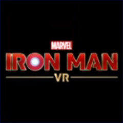 Marvel's Iron Man VR (Demo)
I don't know if the full game's icon looks like this, but it's about as basic as it gets. Iron Man is a recognizable character, but it doesn't feel flashy enough for Iron Man.
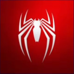 Marvel's Spider-Man
It's a spider on a red background, I guess that can be recognized as Spider-Man easily enough. But that doesn't fly for a Switch icon. Even the box art for the game is Spider-Man on a red void, so that probably wouldn't be much of an improvement as far as that kind of icon.
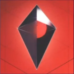 No Man's Sky
While I feel like the minimalist cover art of the game before the Beyond update was a better fit for the game, I don't think just having the crystal obelisk whatever this is as the only thing works for a Switch icon.
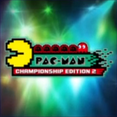 Pac-Man Championship Edition 2
It's Pac-Man, that's clear enough, but the stage light background feels kinda generic, like maybe a music game. A big part of the game is the neon imagery, though, so I guess this works enough.
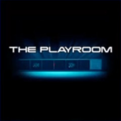 The Playroom
A very minimalist icon, but not so minimalist it's just the logo. This also features the PS4 camera below it, but it's a specific model, not so much the current model that ships with PSVR, so it's a bit dated. Maybe a bit more character would help here.
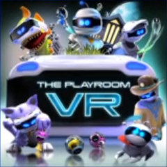 The Playroom VR
The VR follow-up to The Playroom. The icon definitely features a lot more character, as far as having a lot of characters. The logo in the center isn't the most inventive, but it's effective, and this icon feels attractive and aimed at those wanting to jump into VR.
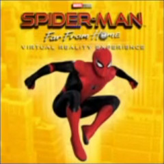 Spider-Man: Far From Home VR Experience
Like the example I mentioned above, this is a logo with Spider-Man himself in front of a colored background, but the background here at least has some texture, so it's a better fit.
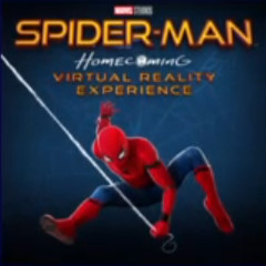 Spider-Man: Homecoming VR Experience
Similar to the last one, just with a more abstract and darker background.
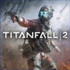 Titanfall 2
This background focuses too much on the pilot and not enough on the Titan mentioned in the title, which makes this feel like another Call of Duty. However, it at least has the box art feel that a Switch icon tends to need.
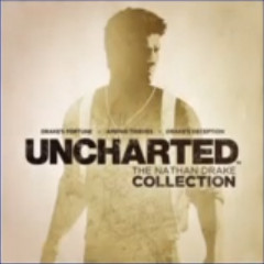 Uncharted: The Nathan Drake Collection
A stylized cover look, showing Nathan Drake in sort of silhouette while the logo is in bold font below. Pretty effective for a "collection" game to imply some sort of premium experience, and fits enough within the Switch icon philosophy.
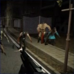 The Unknown City: Episode 1 (Demo)
Really just a screenshot from a game that doesn't seem to have anything specific to it aside from guns and monsters at night. It could be a lot of games.
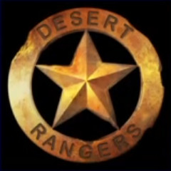 Wasteland 2: Director's Cut
This looks more like a logo for a game called Desert Rangers. It has the "mobile app" feel as other icons have had.
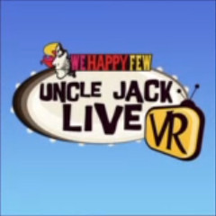 We Happy Few: Uncle Jack Live VR
It's the logo of this VR experience in a blue gradient void. I don't think there's enough influence of either the game's "happy facade" theme or the 60s "mod" theme here, which could be used well in this off-centered-feeling icon's background.
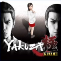 Yakuza Kiwami
Pretty effective and stylized, complete with the logo. Two characters on opposite sides in grayscale while the central character is in color, implying their importance.
I wonder if in the case where the Switch icon philosophy was followed more closely, if PS4 icons might be called out for being redundant in having the title multiple times on the screen, but I don't seem to hear much about PS4 icon enthusiasts compared to those of the Switch. In the time of digital distribution having a significant share in game purchases, I guess those used to the idea of good box art on a shelf want that same feeling on the system. Since several PC digital stores already have virtual box art that actually tends to resemble box art, maybe those on consoles want that "premium" feel too.